Buchreport
The Case against Conformity
Although shop builders have long been talking about „setting the scene“ for goods, little has changed in the last few years. Georg-Maria Hagemeyer, architect and interior designer, puts the case for „highly individual interior design“
It’s a strange thing: No matter where or from whom I buy my shoes, or which shoe shops I happen to notice, apart from slight variations they always look alike. The same goes for drugstores, food shops, banks, the list is endless. The same branch-specific, trivial design conformity everywhere you look, with very few exceptions.
It’s not hard to figure out how things got the way they are. Two interest groups have played a major part in encouraging this trend:
For a start, there are the chain store owners, all of whom are convinced that their branches must look alike so that they can be easily „recognized“. And of course many chain store companies share the view that standardizing their outlets will lead to considerable savings in planning time and investment costs.
Instant recognizability as a basic design criterion has no validity these days,
since nearly nobody goes shopping in Paris today and in Berlin tomorrow.

We know now that only a very small percentage of people buy their shoes at one shop today and somewhere else tomorrow.
Shopfitters, on the other hand, have a vested interest in standardized design. Standardization enables them to streamline their planning and production enormously, which in turn increases their profit margin. Naturally, most shopfitters show a marked reluctance to venture away from their standard programs.
The surprising thing is that investors and their clients are willing to accept this design banality again and again without raising the slightest objection. No-one has the courage or self-confidence to put their own individuality on display. Instead they prefer to put their trust in the apparent safety of standardized planning.
That may be acceptable for soap and salad, but to treat cultural artforms such as music or literature in the same way is surely going too far, for instance when, because design potential is sadly limited,
classical and modern literature or even opera and symphonies are offered for sale in an environment which would be equally suited to trainers or portable radios.
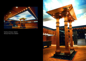
In several outlets of JPC Records we, Hagemeyer & Partner, Architects, have proved that things can be done differently when it comes to recorded music. Using imposing places for listening to music
such as opera houses, concert halls and jazz clubs as our inspiration, we tried to create spatial settings worthy of music as „culture“.
We went as far as producing our very own abstract ceiling painting, using baroque forms and colors, for the central, three-story-high area of the Goettingen store; for the shop in Osnabrock we had larger-than-life busts of class ical composers made by a small workshop in Berlin which still uses traditional methods, to top the high, pompeii-red columns we had erected as a theatrical overelevation
of the intersection of the 4 sales floors. Our aim was to create spatial atmospheres in which the customer can completely submerge himself in a world of music.
And what’s happening in bookstores right now? To get the best results in this genre we thought carefully about how literature is traditionally „consumed“.
The great historical libraries as pointers towards a book-worthy salesroom design
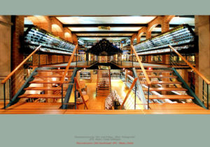
Having an atmosphere-laden library in the comfort of your own home was not only popular with the academic bourgeoisie of bygone days. Our main point of reference however was traditional libraries. And what fantastic, powerful interior designs were successfully created in the past! Michelangelo’s Bibliotheca Laurentiana in Florence springs to mind, or the famous monastery library in St. Gallen – rooms in which literature and knowledge were celebrated with books from floor to ceiling, framed by rows of columns, arcades and galleries.
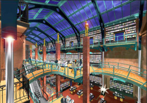
This is the kind of spectacular presentation of books as a spatial experience we were able to realize in our plans for a book and Media Center in the course of the redesign and extension work we carried out on the former Market Hall in Goettingen some years ago.
The idea is to persuade the customer that he is being offered high quality products by a competent dealer. To emphasize this we decided to use honest, durable materials and traditional craftsmanship to enthrall customers with the fascination of architectural design as a physical experience.
It is very important to bear in mind that a „bookseller“ is not simply in the business of „selling books“ but rather using his premises to offer the customer very much more, namely literature, knowledge, entertainment and information.
With this in mind, rooms are created in which the lover of books can browse amongst the high shelves in a relaxed atmosphere which encourages him to rummage at his leisure, glance through valuable folios, and discover hidden treasures which he can take home with him as bargains.
In our experience, most owners and investors are astonished to discover that such highly individual architectural designs are not necessarily more expensive than the usual „off the peg“ shopfittings.
I have heard time and again from clients (and this has been backed up by market surveys carried out with some of my projects as their focus) that on their completion, salesrooms such as these become popular with the local townspeople as sightseeing attract ions. People like to come and spend time in these unusual settings, and the accompanying sales figures prove ultimately that a rejection of conformity was the right decision.


